Snail Stickers for imo

sparkles-animcuddles-animhubba-animkissingselfiequarrelmad-animlaughing-animsmoochies-anim

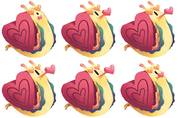
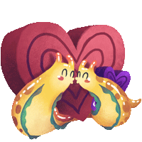
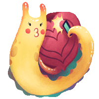
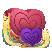
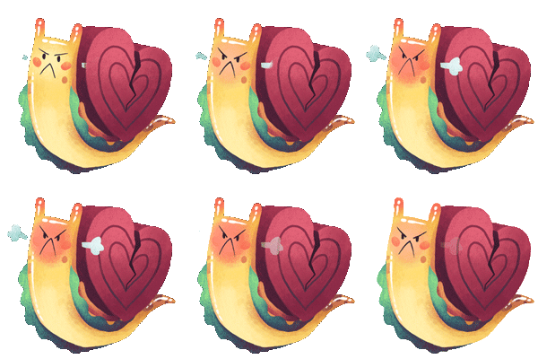
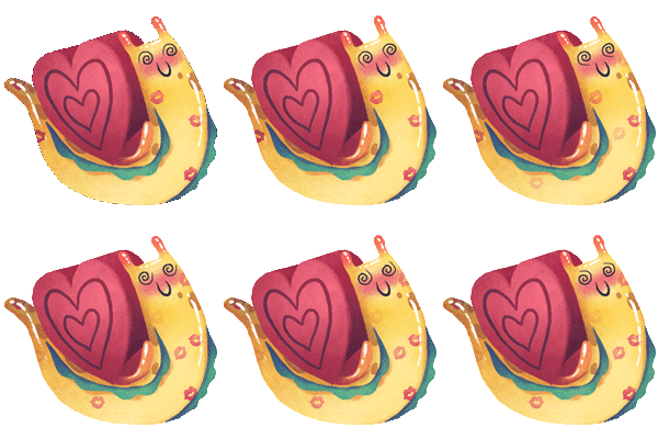
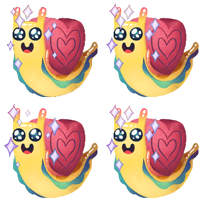
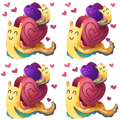
My latest sticker pack for imo has been released!

I was asked to come up with a love-themed pack, and in my research, I came across the factoid that snails fire “love darts” as part of the mating process. (Apparently they, ah, assist fertility?) There are theories that this behavior was part of the origin of the Cupid myth, weirdly enough.

That was enough for me to decide that making some lovey-dovey snails would be an interesting route to take, and here we are!

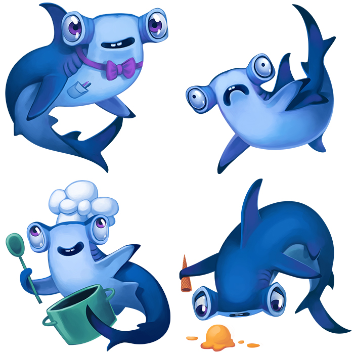
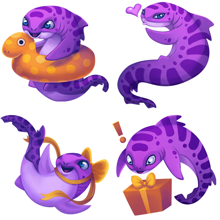
It's Shark Week!

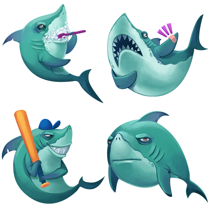
Shark week starts tomorrow! To celebrate, I'd like to share this freshly-released set of shark stickers I made for Path. :) leopard-shark

hammerhead

great-white

Behind "The Do-Good Squad"

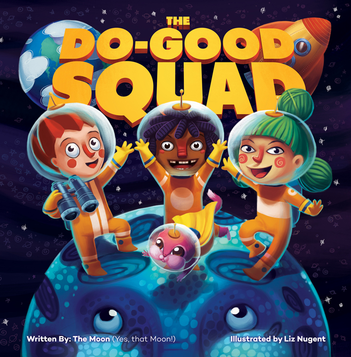
do-good-squad-cover Hey everyone! I had the pleasure (and challenge) of illustrating my very first children's book last winter and I'm finally able to share some of it with you! It's The Do-Good Squad, from a great new publisher called Pin the Map Publishing. Part of their mission is to support great causes by donating a portion of the proceeds from each book to a corresponding charity. This one will help raise money to bring fresh water to Haiti!

I thought it would be fun to share some of the process that lead to the creation of this book cover. When the art director at Pin the Map Publishing first contacted me, he asked me to do a test illustration so he could see my take on the characters - Jack, Jomo, Jin, and Frannie. That was over a year ago, and at the time, I was incredibly proud of it... and in that year (my first year freelancing full-time) my work has grown so much I almost cringe to show it to you now:
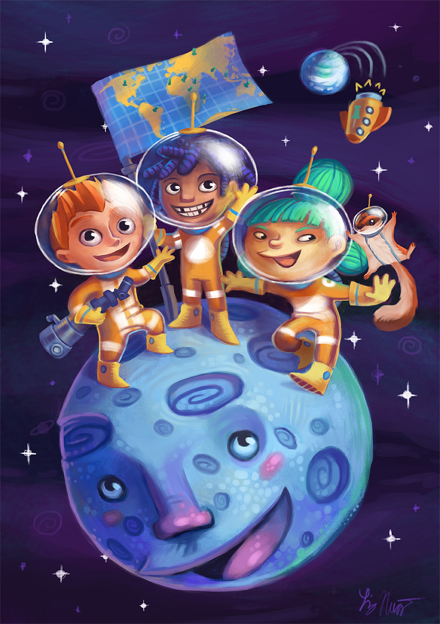
liz nugent - sample illustration

What a difference a year makes! The designs stayed pretty much the same, but the faces have somewhat different proportions, and things just look much tighter in the final cover. Also, Frannie got a total overhaul!

After the test illustration, when we started the project in earnest, I decided it would be helpful to draw up some character sheets to make sure I had details fully nailed down and kept everything consistent:
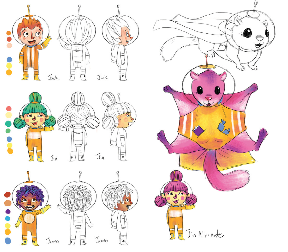
character sheet

I referred to these sheets almost constantly while illustrating the book, especially whenever I drew Jomo's teeth!

After finishing the rest of the book, it was time to figure out the cover. This is when I went back to that test illustration and realized it needed to be completely redone.. after all, I'd had an entire book's worth of practice drawing these kiddos! So that's what we did, keeping the elements that worked and changing the ones that needed it. And that is how the cover was created!

Look for the book on sale this fall! You can get updates on that and the other books from Pin the Map Publishing.
Mermaid Girl

mermaid After enjoying my holiday girl illustration so much, I thought I'd see if lightning would strike twice. :) And it did!

Not only do I love how this came out, I had so much fun working on it! It was wonderful to be able to try different things and see what worked best. I haven't had that with my typical work lately.

I am very excited!

Happy Holidays Card

holiday-girl

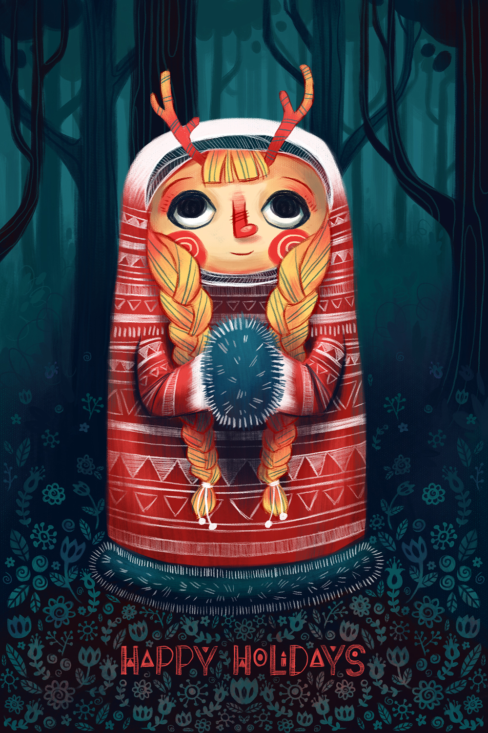
I know, I know, it's a little early! I was just trying to put together a possible promo holiday card to send out.

This is based off of a rejected sketch for another project - I liked the little character idea so I thought I'd run with it as an excuse and opportunity to play more with pattern, texture, and combining dimension and flatness. Because of the subject matter, I also researched some Scandinavian decorative art - super inspiring!

I've been doing a lot of experimenting over the past few months, as I've started to feel a little bit pigeonholed into one approach and it's getting tiresome. Finally, I'm starting to feel like all of this experimentation is starting to come together into a clear voice that feels natural. Very exciting!

Happy Halloween: Wisteria the Witch!

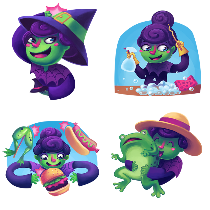
Happy Halloween everyone! To celebrate, I get to share one of the projects I spent this summer working on!

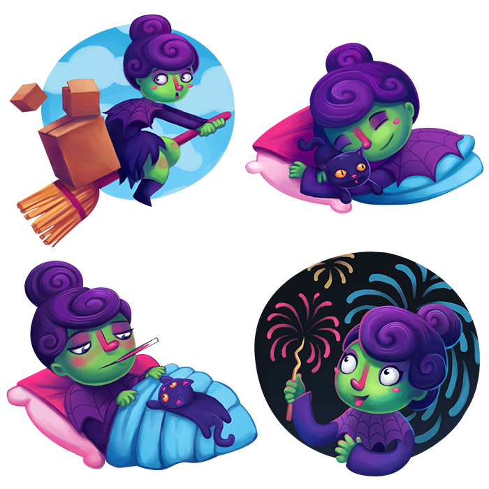
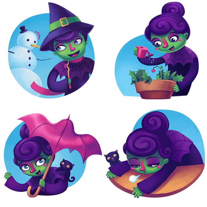
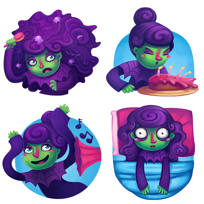
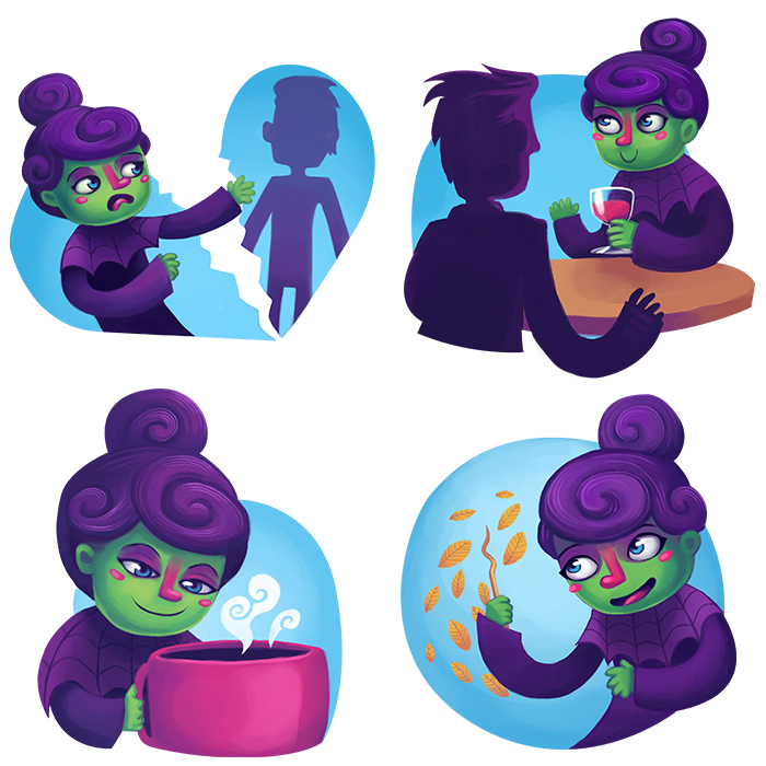
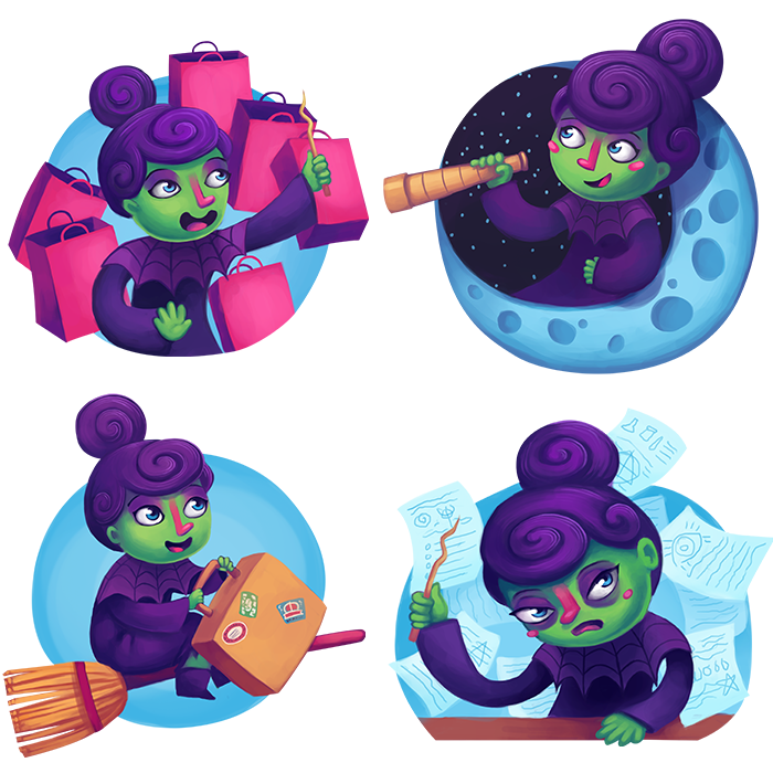
Meet Wisteria, a quirky witch character I created for a virtual sticker pack on the social networking app Path. It's a neat service, designed to purposely be more private than facebook - I can definitely get behind that! They sell a number of different sticker packs in their store, which you can then use to add a little more emotion and personality to your messages. (Here are some others I really like!)

This was just a great assignment from start to finish. My art directors over at Path were just a delight to work with (special shout-out to Leigh Lucas!). You have to love the clients whose suggestions always improve your work. :)

I've never done a series this big before, so that was definitely a challenge. I learned so much, I really wish I'd had an assignment like this in school. It was also really interesting trying to condense a character and an action down into a very simplified image. Some were still a bit overwrought at first, but I was able to pare things down.

So check out Path, and if you'd like to buy the sticker pack for your profile you can get it here!

How to Brown Meat

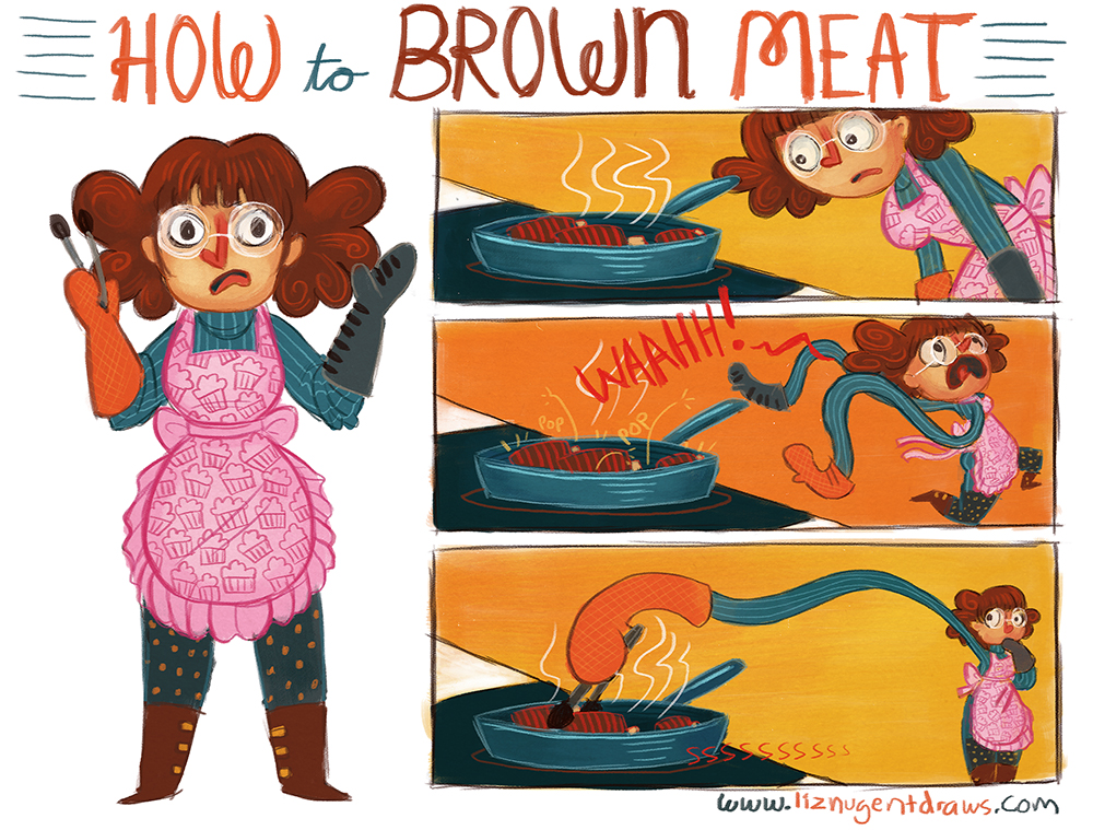
how to brown 2 Still up to my ears in secret stuff I can't post about yet, but I did take the time to draw this little comic about the terror that is hot oil. I don't know why, but short ribs just want to murder me! Or terrify me. I don't have nearly as much trouble with other things.

Ok maybe potstickers too.. and pierogi.. and pork shoulder..

But I have a strategy now!

New house!

My new place!

The area I live in now, Reston, is this 70s planned community. The architecture is so funky and blocky and earth-toned, I find it very fun and inspiring! I had to take a break and doodle some. :)

Mermaid Puzzle

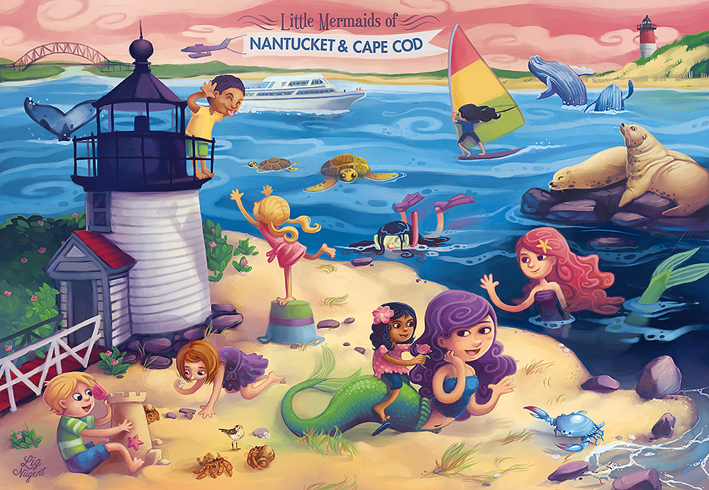
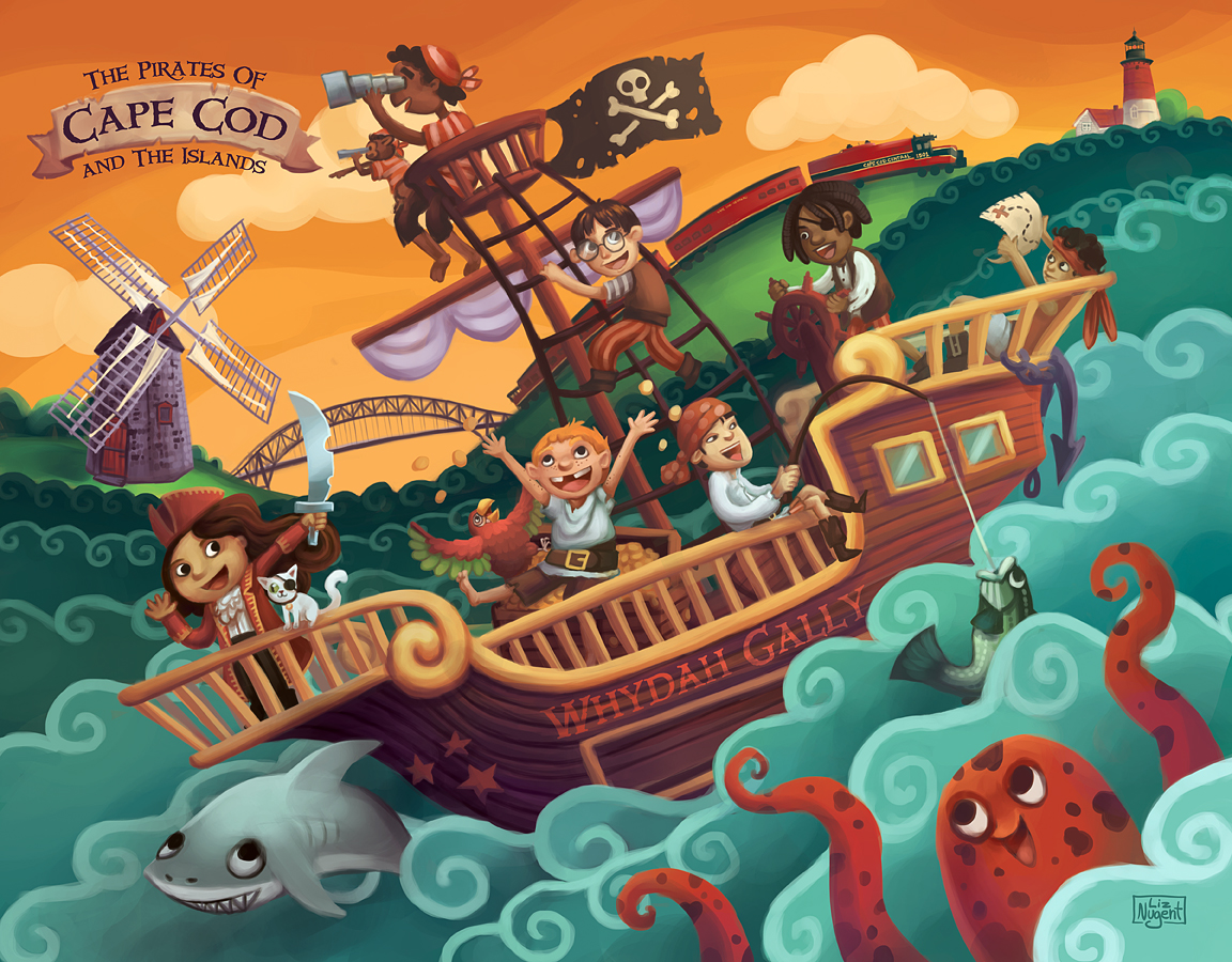
blog - mermaids cape codI got to do another jigsaw puzzle for mud puddle! These are available in select retail stores in and around Boston. :) (I think you can also buy them online if you send an email to mud puddle.)

This is one of the most challenging illustrations I've done to date - the composition was way more complex than the pirate puzzle I'd done previously. But again, I really learned a lot - and most of this piece was really useful practice for the GP Miami playmat I had to illustrate a few weeks later.. :)

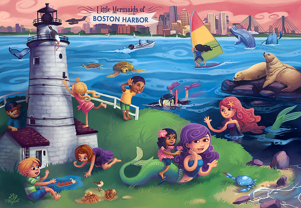
Like the pirate puzzle, I had to do a second background for this piece to reflect a different locale, in this case, Boston Harbor. Unlike the pirate piece (where I just changed a few buildings on the skyline), this required a dramatic overhaul of the composition. It was.. intense! I'm fairly pleased with the results, though:

blog - mermads boston

Creature Collection: Turtle

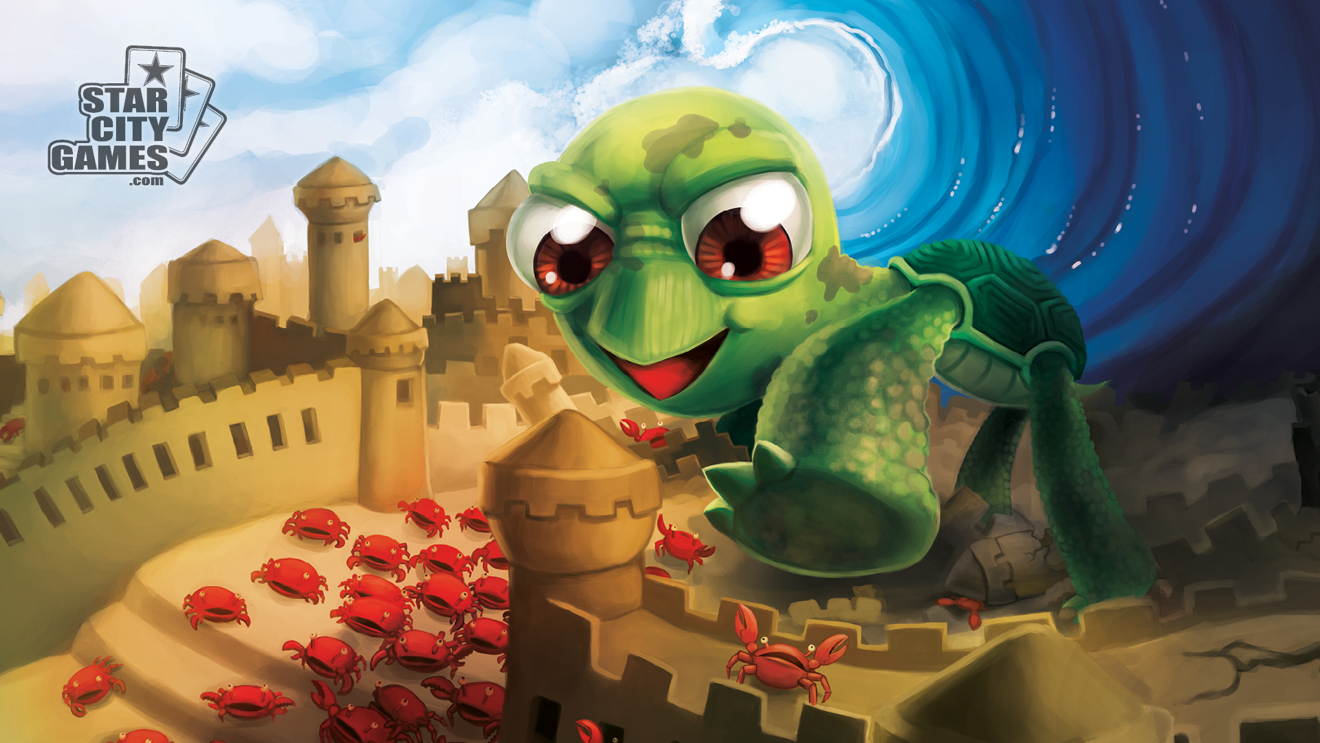
TurtleWallpaper1920x1080 The last of my Creature Collection for StarCityGames.com! (For now..)
It’s weird to me to be just showing this piece now, because I’ve already been able to show off pieces that use knowledge I learned from doing this one (notably, the GP MIami Playmat.) At this point, this guy is over a year old..

Anyway, get your dicebags (sunglasses cases!), playmats (mousepads!), deckboxes, cardboxes, posters, & etc now! I’m very proud to say that they’ve sold out of products early on more than once, so get ‘em while you can! :)

Creature Collection: Zombies

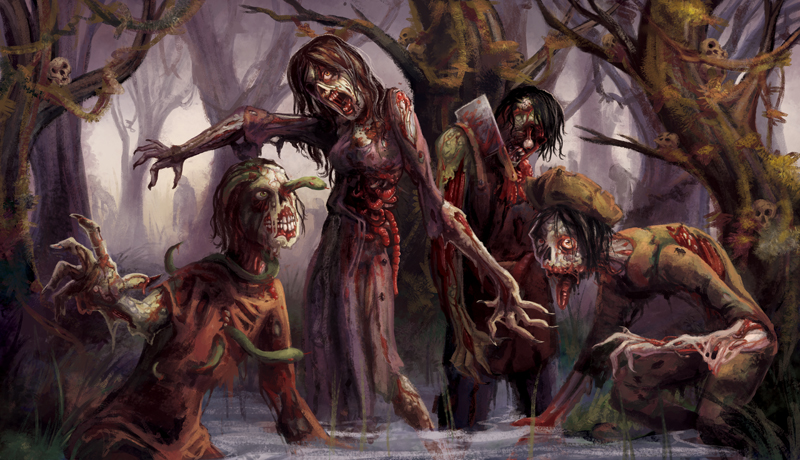
Creature Collection - Zombies Another StarCityGames.com Creature Collection piece revealed! Like the others in the series, this illustration is printed on a line of trading card game accessories - card sleeves, playmats, deckboxes, cardboxes, and dicebags. They're also being printed as promotional tokens given out by StarCityGames.com for use while playing Magic: The Gathering. :)

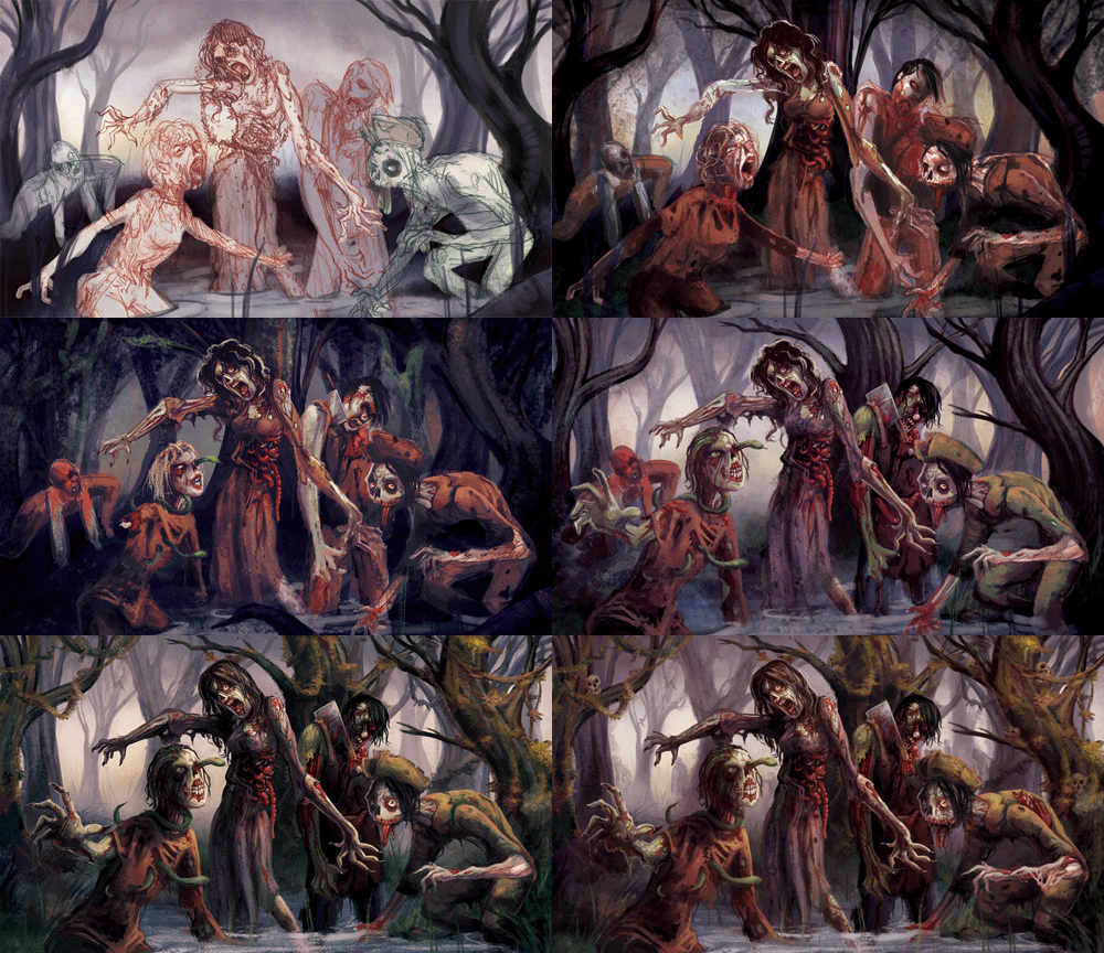
This piece was the first time I actually approached the image knowing it was going to be on a playmat. For the others, for various reasons, I did the token first and then expanded it out to fit the playmat/deckbox layout. Because of that, this is the only one with a whole cast of characters. The fun thing is that we then got to give each one their own token! :)

I actually really, really enjoyed doing this piece. I used a different brush set than usual (I honestly tend to stick with the default round) and got really excited about the textures and colors. The little guy in the lower right is my favorite, he just looks so cute. :)

WIP GIF TIME!

zombie-wip

Creature Collection: Vampire


Another piece released for StarCityGames.com!

This one was a weird one. Initially, the plan was to have cute/whimsical pieces by me interspersed with more traditional fantasy fare by another artist. The other artist fell through, but deadlines are deadlines, so they asked me to step in- and out of my comfort zone!

This piece actually felt a bit like a throwback. Before I went to art school, I was a lot more interested in realism/concept art/etc, and I used to do paintings like this a lot.. mostly as World of Warcraft fanart. :P (You can see some here!)

It was pretty cool to do something so different and challengingl I learned a lot about how my workflow and preferences have changed over the years. :)

Lastly - this piece would not have been possible without my amazing model, Paul. :D <3 <3

Creature Collection: Penguin

Another piece that’s been waiting in limbo!!

This is the first of a series of illustrations I’ve done for my day job at StarCityGames.com. The illustrations are each being released as full lines of products for trading card game players :D (Sleeves, deckboxes, playmats, etc.)

The set with this illustration are now FOR SALE on their site, including in particular the playmat (which is like a giant mousepad) and the dicebag (which is actually a sunglasses case!)

It’s all been a very bewildering and wonderful experience. :) I hope you all enjoy what I’ve made and what’s yet to come!