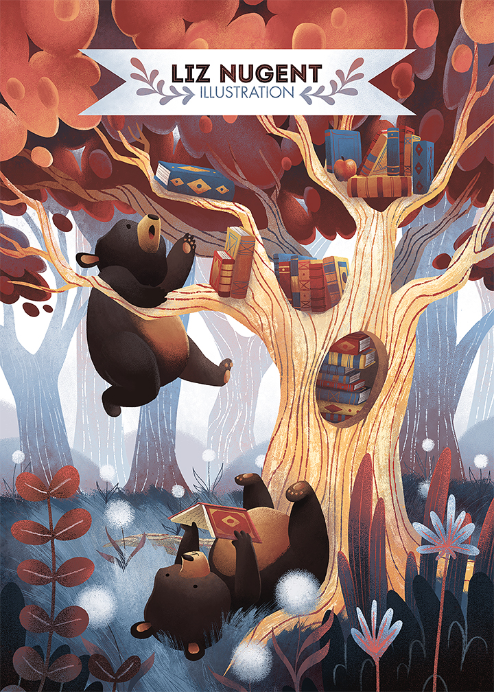
 New promo postcard illustration! Still have to draw/design the back, then I'll be ordering a big stack of these to send around.
I have a part-time job as a children's art teacher. One of the things I do at that job is create sample images for our various assignments. So basically I do a drawing that fits the prompt, aiming for roughly the level of detail/complexity my students can handle, and color it with the same materials they use. It's SUPER fun and I kinda can't believe I get paid to do it every week!
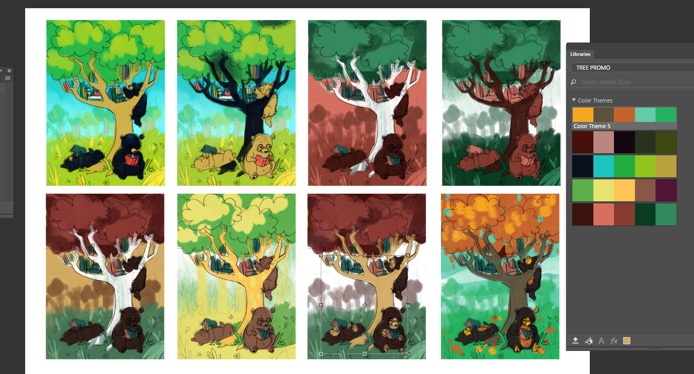
Anyway, the original drawing for this came about from one of those samples. I didn't change the composition much,(Although I changed how I drew the bear - my students kept thinking it was a hedgehog or a beaver or a hamster.. oops!) but I wanted to go with a less expected color palette than what I used initially. I fussed with it a lot and even did a host of color studies, assisted by the color tools in the Adobe Capture App. I was really trying to make the green work! But ultimately, I just had to kill it. Wasn't working for me. Modified primary palette it is!

